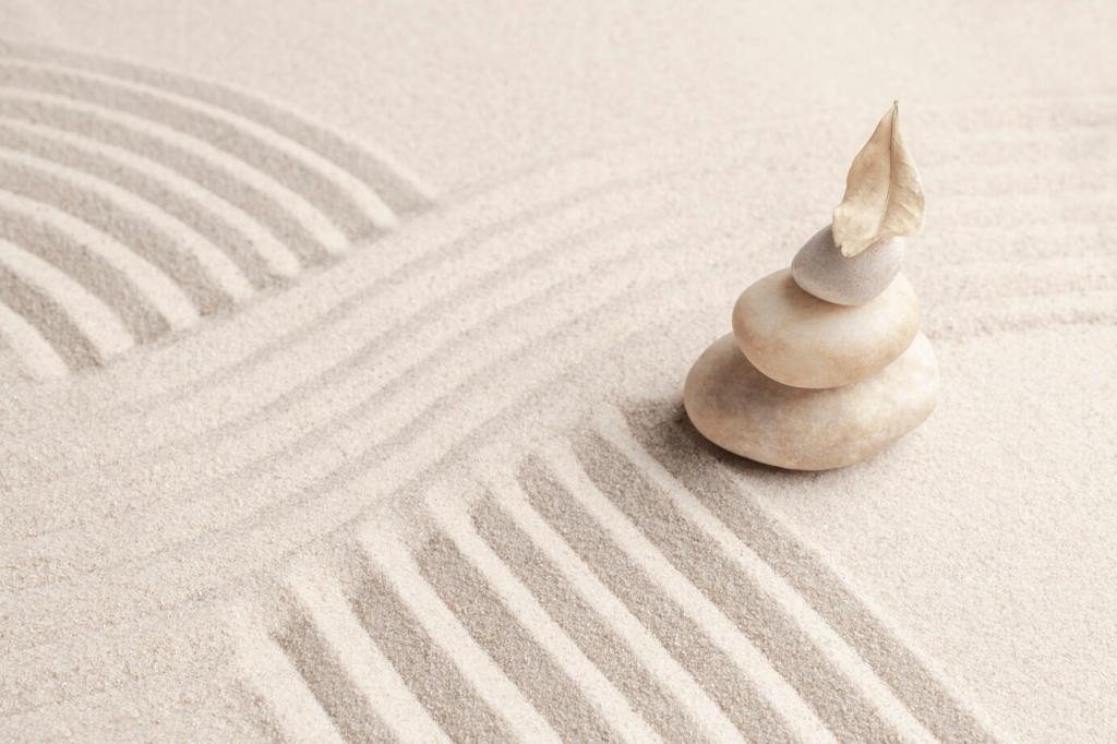
The Psychology of Quiet Hues
Soft neutrals calm because they remove visual friction. Pale taupes, warm off-whites, and misty grays invite your gaze to rest, slowing breath and mind. Studies show low-saturation colors often reduce arousal, supporting focus and gentle, restorative daily rituals.
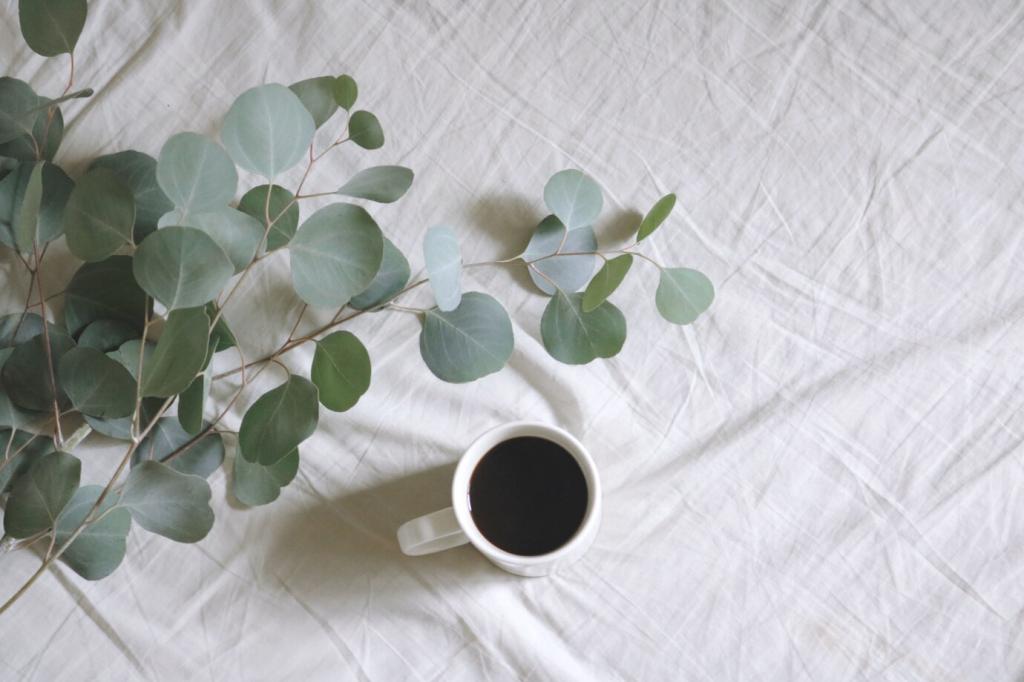
The Psychology of Quiet Hues
Minimalist palettes favor desaturated tones that whisper instead of shout. By muting chroma, the room stops competing for attention, and your nervous system feels less urgency. The result is steadiness: a space that greets you like a long, exhale.